
General Guidance
- Use a variety of components to keep people engaged as they scroll. Don’t use too many of one component type on a page and follow the guidance in this Style Guide in selecting the right component for your content.
- Experiment with components. There’s probably a better component for that middle-of-the-page content than paragraph text — try out the Collapsible Content component, Grid component, or a variation of the flexible Column Control component.
- Don’t get too cramped. Use spacers to add breathing room and negative space between components.
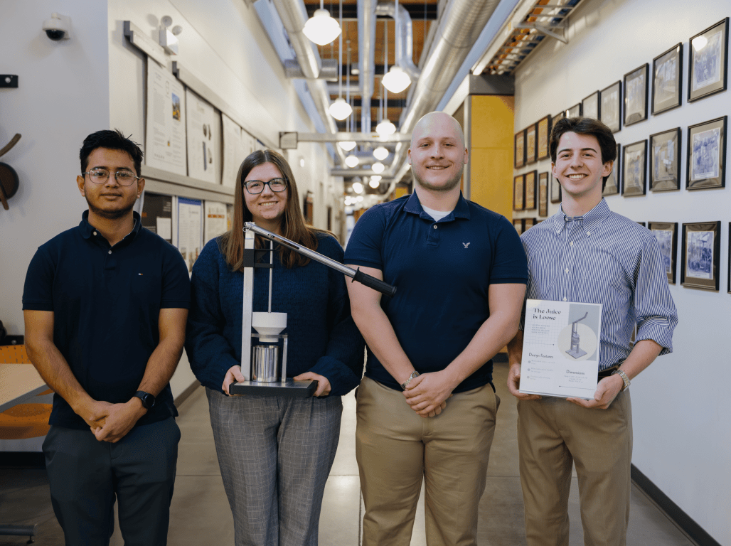
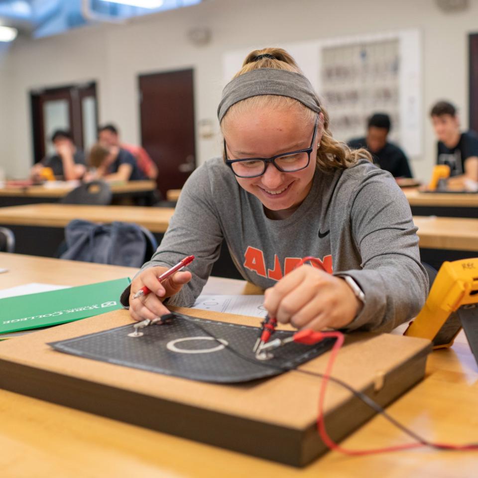
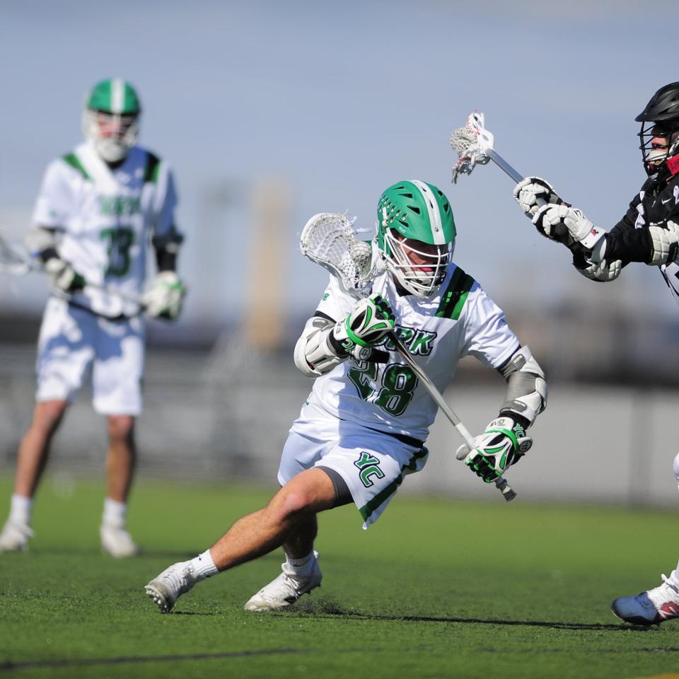
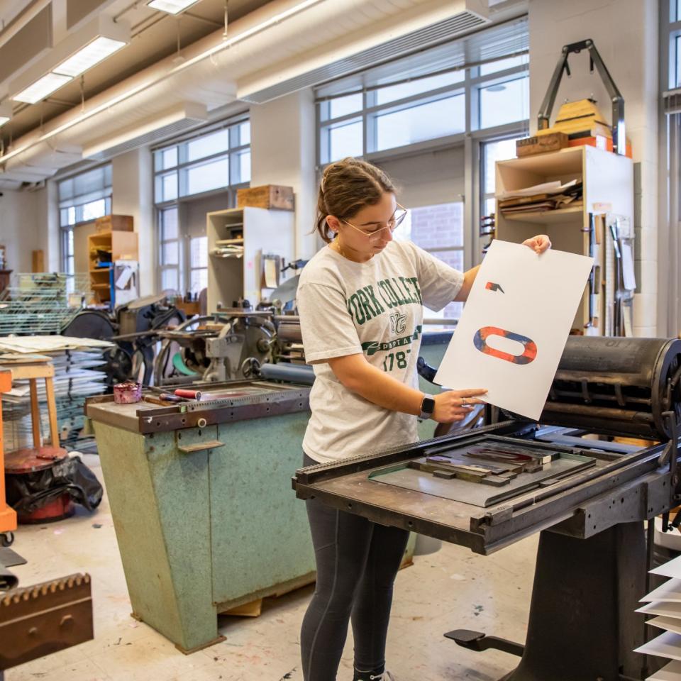
- Let photography do some of the work. Use vibrant and content-specific photography to enhance page visuals. The flexible Column Control component is great for incorporating photography into pages.
Type Styles
These are the typographic styles available when working with text. Many components have preset typographic styles that can serve as a good reference when setting headlines, sub-headlines, paragraph text, or captions.
H2 – The quick brown fox jumps
H3 – The quick brown fox jumps
H4 – The quick brown fox jumps
H5 – The quick brown fox jumps
H6 – The quick brown fox jumps
Lorem ipsum dolor sit amet, consectetur adipiscing elit. Maecenas tincidunt amet urna a porta lobortis. Aliquam sit amet eros quam. Fusce venenatis ipsum non est porta porttitor. Curabitur aliquet mattis elit. Mauris eget velit bibendum, auctor risus eu, elementum sem. In-line link, bibendum in efficitur ut.
Lorem ipsum dolor sit amet, consectetur adipiscing elit. Maecenas tincidunt amet urna a porta lobortis. Aliquam sit amet eros quam. Fusce venenatis ipsum non est porta porttitor. Curabitur aliquet mattis elit. Mauris eget velit bibendum, auctor risus eu, elementum sem. In-line link, bibendum in efficitur ut.
Font Styles & Colors
The sans-serif Galaxie Polaris is the primary font family for the York website. Below are the pixel sizes and HEX colors for easy reference.
H2 – 48 px, 348338
H3 – 36 px, 348338
H4 – 28 px, 154C26
H5 – 22 px, 348338
H6 – 16 px, 154C26
Paragraph - 16 px, 14C26
The official colors of the York College logo are Pantone 7740 or black. When using Pantone 7740 is not possible, the following color builds should be used to obtain the best match for “York College green.”
On Screen
- RGB: 91.153.68
- HEX: 239A3A
Variations of York College Green
For accessibility and usability, we have incorporated variations of the York College green throughout the website. These colors are for digital design purposes only and are not to be incorporated into print pieces.
- HEX: 154c26 (darker green)
- HEX: 348338
- HEX: 8bc700 (lighter green)
- HEX: 3a913f

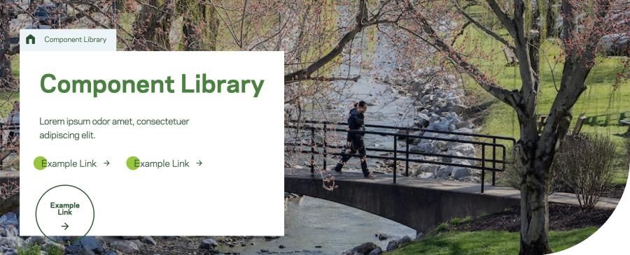
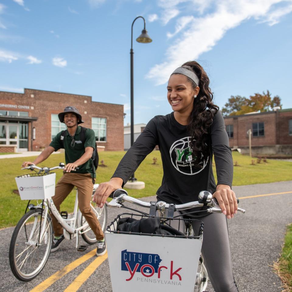
Hero Component Overview
This component's main function is to occupy the top section of a page, immediately captivating the viewer upon their initial navigation to the page. Its components include a Title, Header Description text, Body Text, Image, and Links.
Hero Component: Full-Width Image
This component's main function is to occupy the top section of a page, immediately captivating the viewer upon their initial navigation to the page. This component features a full-width image.

Hero Component: Full-Width Image with Headline
This component's main function is to occupy the top section of a page, immediately captivating the viewer upon their initial navigation to the page. Its components include a Title, Header Description text, Body Text, Image, and Links.
Hero Component: No Image
This component's main function is to occupy the top section of a page, immediately captivating the viewer upon their initial navigation to the page. Its components include a Title, Header Description text, Body Text, and Links.

WYSIWYG
This component is used for full-width text content. It includes options for headlines, images, list-items and links.
Text Block Grid / Link List
The primary function of this component is to present content as individual cards of information. Each card contains a subheading, body copy/description, and a link. There are two available background colors to choose from: Light Grey and Green. There are two link options. You can link the title or add a button link at the bottom.
Text Block Grid - Title and Links
Lorem ipsum dolor sit amet, consectetur adipiscing elit. Maecenas tincidunt urna a porta lobortis. Aliquam sit amet eros quam. Fusce venenatis ipsum non est porta porttitor. Curabitur aliquet mattis elit. Mauris eget velit bibendum.
Text Block Grid - Title and Descriptions, No Links
Lorem ipsum dolor sit amet, consectetur adipiscing elit. Maecenas tincidunt urna a porta lobortis. Aliquam sit amet eros quam. Fusce venenatis ipsum non est porta porttitor. Curabitur aliquet mattis elit. Mauris eget velit bibendum.
Newman Club (Catholic Campus Ministry)
The York College Catholic Newman Club is a community of students who help each other to grow by using their gifts to spread love in our community and the world through worship, service, study, prayer, leadership, and the promotion of justice and peace.
Hillel
Hillel is a national organization that offers spiritual guidance and other activities for students of the Jewish faith. The York College chapter maintains Jewish traditions with a variety of on-campus activities and holiday celebrations.
Inter-Varsity Christian Fellowship
Inter-Varsity Christian Fellowship is an evangelical campus mission. Students gather at small group Bible studies, large gatherings on campus, leadership training, conferences, and events. Affiliated with Inter-Varsity are the groups Athletes for Christ and Christian Nurses.
Habitat for Humanity
The York College chapter is a student organization that partners with York Habitat for Humanity, a nonprofit, non-denominational Christian ministry that helps to build homes with families in need. The group has workdays and organizes other social events.
Young Life National Christian Organization
Young Life is a non-denominational Christian organization that focuses on outreach and engagement. It seeks to build meaningful relationships with young people through sharing the message of Christianity in a relatable and inclusive way.
Text Block Grid - Title, Descriptions, and Links
Lorem ipsum dolor sit amet, consectetur adipiscing elit. Maecenas tincidunt urna a porta lobortis. Aliquam sit amet eros quam. Fusce venenatis ipsum non est porta porttitor. Curabitur aliquet mattis elit. Mauris eget velit bibendum.
Linked Heading
Unlinked Subtitle
Lorem ipsum dolor sit amet, consectetur adipiscing elit. Maecenas tincidunt urna a porta lobortis. Aliquam sit amet eros quam. Fusce venenatis ipsum non est porta porttitor. Curabitur aliquet mattis elit. Mauris eget velit bibendum.
Unlinked Title
Lorem ipsum dolor sit amet, consectetur adipiscing elit
Longer Title with Link
Unlinked subheading
Lorem ipsum dolor sit amet, consectetur adipiscing elit. Maecenas tincidunt urna a porta lobortis. Aliquam sit amet eros quam. Fusce venenatis ipsum non est porta porttitor. Curabitur aliquet mattis elit. Mauris eget velit bibendum.
Long Title with No Linked Page
Subheading optional
Lorem ipsum dolor sit amet, consectetur adipiscing elit. Maecenas tincidunt urna a porta lobortis. Aliquam sit amet eros quam. Fusce venenatis ipsum non est porta porttitor. Curabitur aliquet mattis elit. Mauris eget velit bibendum.
Card Grid
This component displays page information as cards. Each card includes a headline, short description and a link to the accompanying page.
Card Grid
Lorem ipsum dolor sit amet, consectetur adipiscing elit. Maecenas tincidunt urna a porta lobortis. Aliquam sit amet eros quam. Fusce venenatis ipsum non est porta porttitor. Curabitur aliquet mattis elit. Mauris eget velit bibendum.


Two Column Callout
This component features two columns. There are left and right alignment variants of this component alternating between photos and text with links. There are three background colors to choose from: White, Light Grey, and Green. There is one additional style called Grid. The Grid style adds a notch design element to the image.

Two Column Callout - White Background
Lorem ipsum dolor sit amet, consectetur adipiscing elit. Maecenas tincidunt urna a porta lobortis. Aliquam sit amet eros quam. Fusce venenatis ipsum non est porta porttitor. Curabitur aliquet mattis elit. Mauris eget velit bibendum.
Two Column Callout - Light Green Background
Lorem ipsum dolor sit amet, consectetur adipiscing elit. Maecenas tincidunt urna a porta lobortis. Aliquam sit amet eros quam. Fusce venenatis ipsum non est porta porttitor. Curabitur aliquet mattis elit. Mauris eget velit bibendum.
Two Column Callout - Dark Green Background
Lorem ipsum dolor sit amet, consectetur adipiscing elit. Maecenas tincidunt urna a porta lobortis. Aliquam sit amet eros quam. Fusce venenatis ipsum non est porta porttitor. Curabitur aliquet mattis elit. Mauris eget velit bibendum.
Two Column Callout - Grid Background
Lorem ipsum dolor sit amet, consectetur adipiscing elit. Maecenas tincidunt urna a porta lobortis. Aliquam sit amet eros quam. Fusce venenatis ipsum non est porta porttitor. Curabitur aliquet mattis elit. Mauris eget velit bibendum.
Testimonial with Quick Facts / Quote with Image
This component features two elements: quotes and Quick Facts. Quick facts are used to display a variable number of facts that can be highlighted. Pulled quotes allow for a large-scale display of a quote and an attribution. Quotes featured in this component must showcase the author of the quote and a secondary attribute. Quotes should not exceed (insert character amount). This component also features a photo and link.


News Grid
This component shows cards of recent news. Content is selected by choosing a category linking URLs or with titles. It displays the three most recent articles selected from a category. These cards include a date, photo, and headline.
News Grid
View More News
Media Grid
This Media Grid component allows for both images and MP4 video files. The images/videos auto-rotate so the user will see the full carousel if they don’t continue to scroll down the page.


CTA Billboard
This component allows for an image or video with a headline, body text, and links underneath. The image or video is confined to the margins of the site.

CTA Billboard
Lorem ipsum dolor sit amet, consectetur adipiscing elit. Maecenas tincidunt urna a porta lobortis. Aliquam sit amet eros quam. Fusce venenatis ipsum non est porta porttitor.

CTA Billboard - Sample YouTube Embed
Lorem ipsum dolor sit amet, consectetur adipiscing elit. Quisque a enim justo. Morbi nec odio odio. Aliquam efficitur, libero ut consequat porta, odio lorem placerat leo, nec dictum lorem libero vel nulla.
Accordion
This component is used to truncate large amounts of information on very text/content-heavy pages and keep scroll depth down to create the best possible UX. Items in the accordion component are variable in number.
Accordion
Lorem ipsum dolor sit amet, consectetur adipiscing elit. Maecenas tincidunt urna a porta lobortis. Aliquam sit amet eros quam. Fusce venenatis ipsum non est porta porttitor. Curabitur aliquet mattis elit. Mauris eget velit bibendum.
Lorem ipsum dolor sit amet, consectetur adipiscing elit.
Lorem ipsum dolor sit amet, consectetur adipiscing elit. Maecenas tincidunt urna a porta lobortis. Aliquam sit amet eros quam. Fusce venenatis ipsum non est porta porttitor. Curabitur aliquet mattis elit. Mauris eget velit bibendum. Lorem ipsum dolor sit amet, consectetur adipiscing elit. Maecenas tincidunt urna a porta lobortis. Aliquam sit amet eros quam. Fusce venenatis ipsum non est porta porttitor. Curabitur aliquet mattis elit. Mauris eget velit bibendum.
Event Grid
This component displays cards of various events that do not fall into a specific category. The cards should include the date of the event, time, and location. Clicking on a specific card leads you to an accompanying page with more information about the event. This card integrates with 25Live, the campus events calendar.
Event Grid
25Live Events Calendar
The data feed for this component is generated by third-party software, providing a fixed set of information that cannot be altered or customized by individual users
25 Live Events Calendar
Ut enim ad minim veniam, quis nostrud exercitation ullamco laboris nisi ut aliquip ex ea commodo consequat. Duis aute irure dolor in reprehenderit in voluptate velit esse cillum dolore eu fugiat nulla pariatur.
Directory Grid
This component displays cards of quick contact information for faculty based on the department selected. The click-through page contains all supplied contact information, a biography text field, and the ability to add additional components to the page.
Directory Grid
Link Label


Table
The table component uses the WYSIWYG component and includes an optional title, description, and link.
Table
Lorem ipsum dolor sit amet, consectetur adipiscing elit. Maecenas tincidunt urna a porta lobortis.
| Column 1 | Column 2 | Column 3 |
|---|---|---|
| Data 1-1 | Data 2-1 | Data 3-1 |
| Data 1-2 | Data 2-2 | Data 3-2 |
| Data 1-2 | Data 1-2 | Data 1-2 |
| Data 1-2 | Data 1-2 | Data 1-2 |
| Data 1-2 | Data 1-2 | Data 1-2 |
| Data 1-2 | Data 1-2 | Data 1-2 |
| Data 1-2 | Data 1-2 | Data 1-2 |
| Data 1-2 | Data 1-2 | Data 1-2 |
Spacer
The spacer grid us used to add/remove space between components. Positive values (50px) will add space, and negative values (-50pc); will remove space.